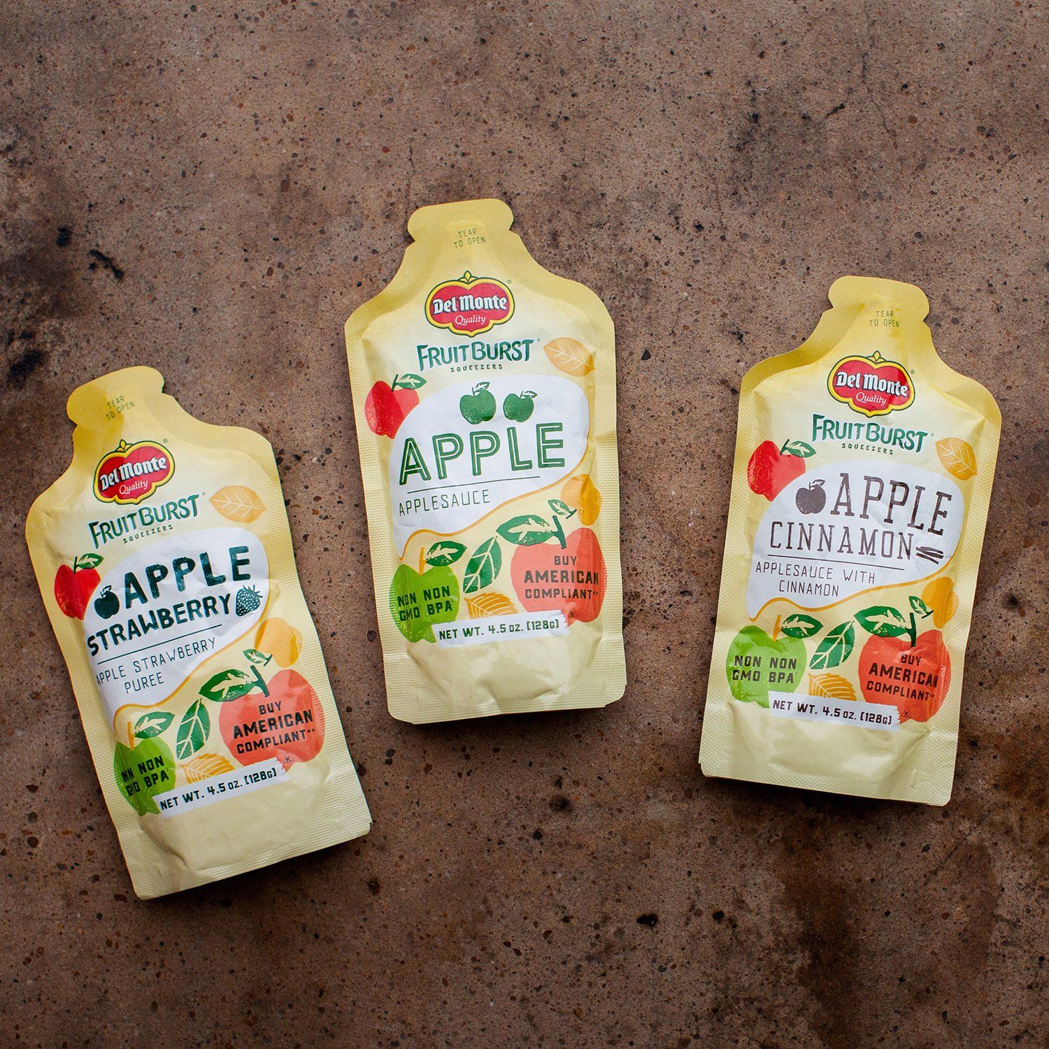
CLIENT WORK | Del Monte® Fruitburst® Squeezers
Packaging design work is always different, and usually presents interesting challenges that most consumers never know about. This particular project required some pretty extensive and creative problem solving, but in the end we were thrilled with the results (and happy to send off to the printer!). We get pretty technical in this blog post, but honestly, this was a super technical project so it’s hard to talk about it otherwise. Design is way more than just making things look great.
the foodservice challenge
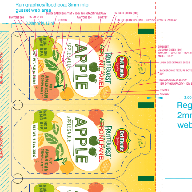
This project was a specifically K-12 foodservice package, meaning that the only place you’d probably ever see this would be at a school. Foodservice as a general industry has much tighter margins than retail products (which are still pretty tight!) so our client really needed to keep the print costs down. The squeezers come in three different flavors that each have unique nutrition facts, ingredients statements and UPCs, so the packages couldn’t be completely the same. However, we worked with the client and the printer to come up with a solution using Pantone colors where all of the printing cylinders would be the same across the three flavors, and each flavor would only need one distinct cylinder. (The print process used is called gravure, which basically means the design is engraved onto a cylinder, ink is applied to the cylinder and then rolled over the foil substrate.) So, without going too much more in depth about the technicalities of printing, here is what our final files looked like when we sent them off! Lots of left-braining going on here ;)
the final packaging
We were so excited to finally get physical samples from Del Monte and be able to share this now that it’s out in the marketplace. I am sure they’re tasty, too, but since we only got one set of samples we’ll just have to trust them.