the latest from formada creative
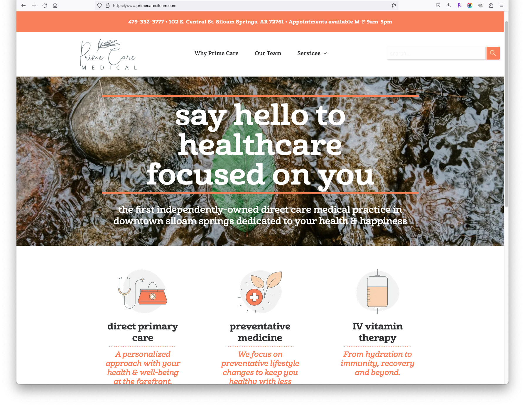
This winter, we overhauled Prime Care Medical's website to better communicate their focus on lifestyle and preventative medicine as a direct-care provider. In addition, we added an exclusive patient-only monthly newsletter to help keep engagement high and add to the benefits provided by the clinic. The response so far has resulted in high patient retention and new patient acquisition. View the live website here: www.primecaresiloam.com
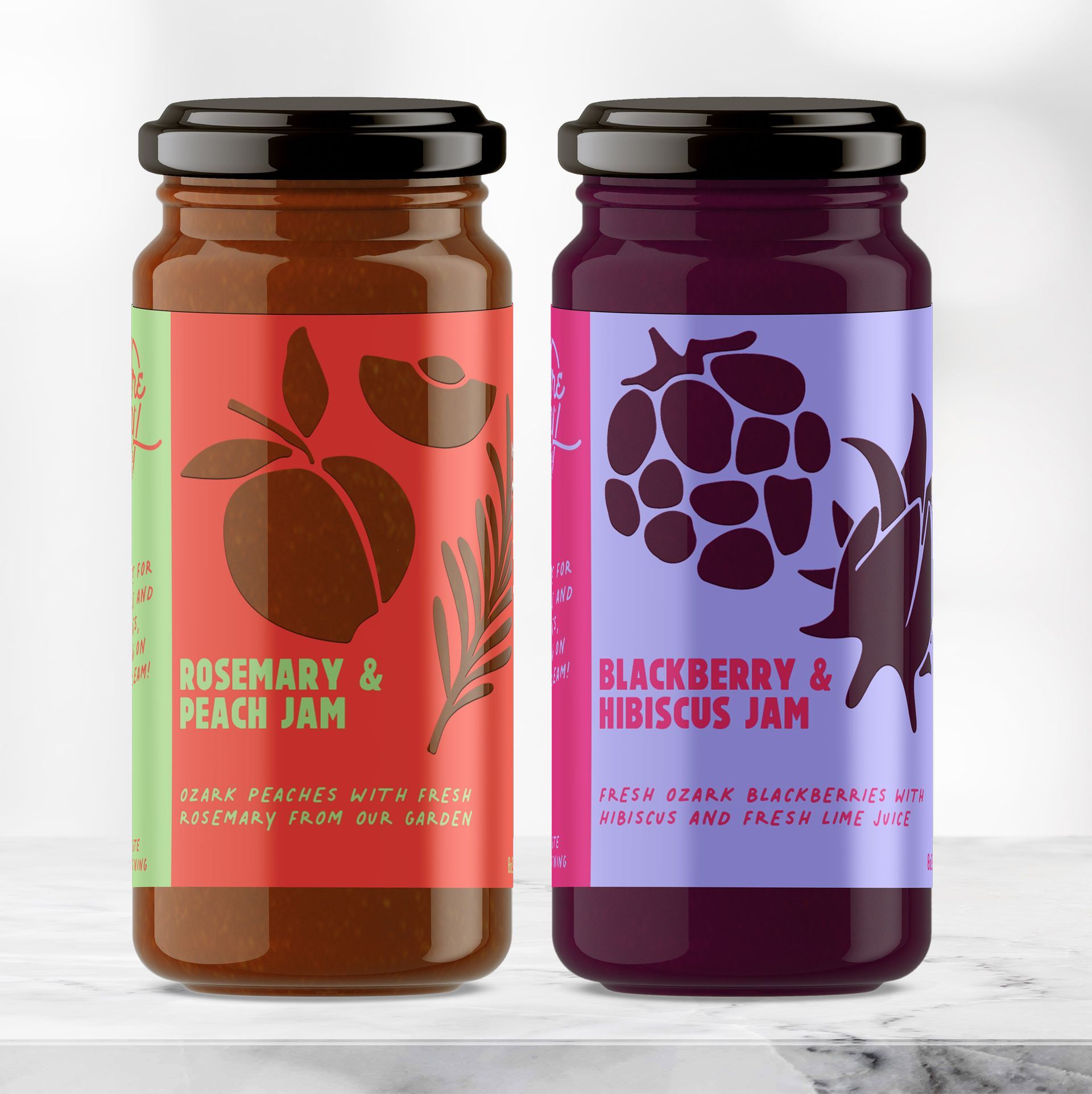
The new year is upon is, which means alllll the trends for the year are coming out! We love this time as a way to reset, re-evaluate, and make sure we're on top of what's happening in the design world. With digital printing becoming the norm and ecommerce still growing steadily, it seems easier than ever to stay nimble and adaptable with the changing marketplace. Of course, we don't want to get too trendy if we're creating long-lasting packaging, but incorporating some of these elements will help keep you relevant. Here's what we're seeing ahead for packaging design in 2023!
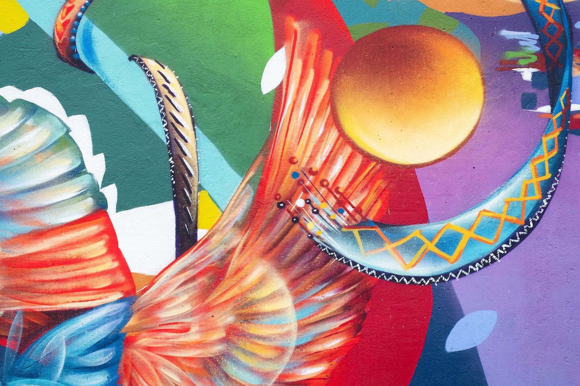
There are murals, and then there are **M U R A L S** This past fall, Yatika Starr Fields - Osage, Cherokee, Muskogee from Tulsa, OK - graced our new memorial park with the most incredible mural my eyes have ever seen. Over the course of about a week, we got to know Yatika and were able to capture some great images of the process.
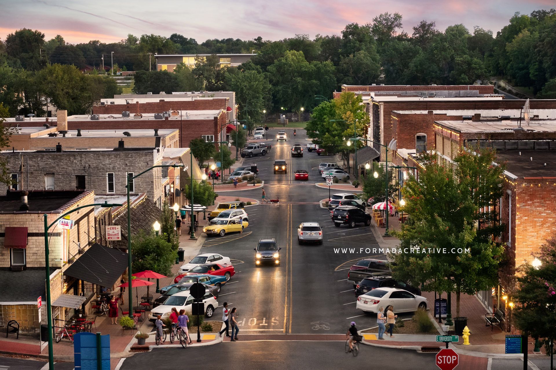
It isn't every day that you get to float above the street in a bucket truck (unless, of course, you work for the electric dept.) but Meghan got to do that a few weeks ago to capture an updated photo of downtown Siloam Springs. It was fun to see the town from above and watch squirrels running around on the power lines!
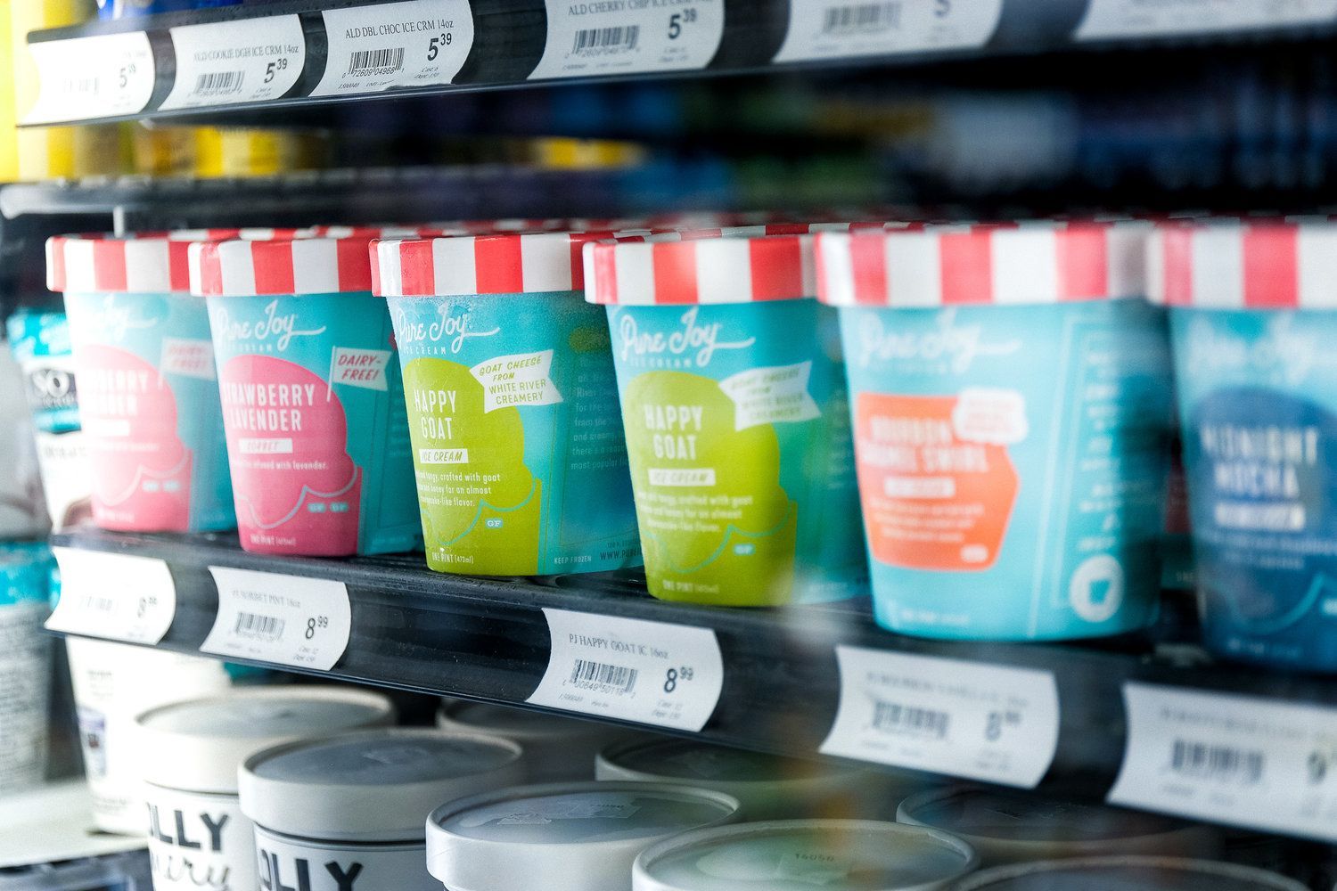
Sometimes, a complete packaging redesign can feel pretty intimidating. Customers are frequently on auto-pilot while they’re shopping, so if they don’t see something familiar they might just breeze on past without picking up your product. When we started the redevelopment of Pure Joy Ice Cream’s pint packaging, we put a lot of thought into the process to ensure that even though this packaging would be entirely new and different, customers would notice it and it would resonate with the brand. Since Pure Joy is just a regional brand and many grocery customers have interacted with either their shop or one of their catering carts, we decided to make the pints reminiscent of the shop/cart look and feel.
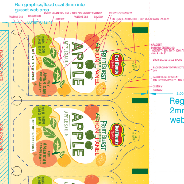
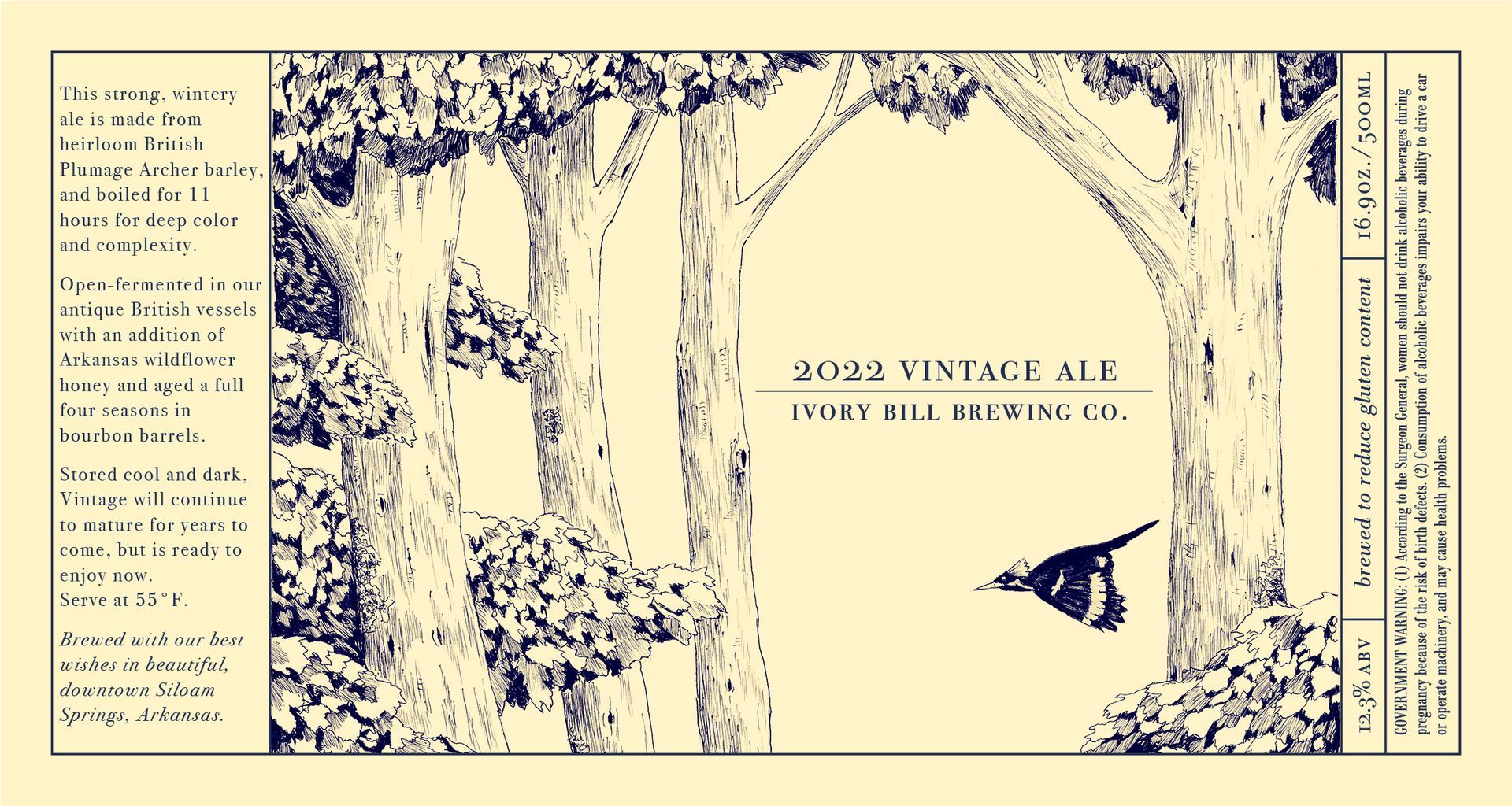
Packaging design work is always different, and usually presents interesting challenges that most consumers never know about. This particular project required some pretty extensive and creative problem solving, but in the end we were thrilled with the results (and happy to send off to the printer!). We get pretty technical in this blog post, but honestly, this was a super technical project so it’s hard to talk about it otherwise. Design is way more than just making things look great.
